Color in Art — Psychology, Symbolism, and Harmony
↓ Share this articleColor in Art: Understanding, Experiencing, and Choosing
Color plays an essential role in art. It draws the eye, structures the composition, creates an atmosphere, and evokes an immediate emotional response. In a painting, sculpture, or ceramic piece, it can soothe, energize, surprise, or unsettle. To discuss color in art is therefore to discuss technique, sensibility, and decorative art all at once. For art lovers and collectors alike, understanding color helps not only in appreciating a work of art but also in integrating it harmoniously into an interior.
In Dreux, the L’Adresse des Maîtres® Art Gallery fully embraces this philosophy by offering works in which texture, light, andcolor harmony play a central role. This approach is particularly helpful when choosing a piece of art that complements your living space.
Color Theory: The Color Wheel, Primary and Complementary Colors
Color theory forms the basis of all visual interpretation. The starting point is the color wheel, a tool that helps us understand the relationships between colors. It organizes hues based on their proximity and contrasts. Thanks to it, artists, interior designers, and enthusiasts can better understand how a color palette works.
We generally distinguish between the primary colors: red, blue, and yellow. They are called primary because they serve as the basis for many other color combinations. By mixing them, we obtain secondary colors: orange, green, and purple. These relationships already create an initial sense of visual balance.
The color wheel also helps identify complementary colors. These are the colors directly opposite each other on the wheel: red and green, blue and orange, yellow and purple. When paired, they create a strong, vibrant contrast. In art, this effect can intensify a scene, highlight a detail, or create expressive tension.
Conversely, colors that are close together on the color wheel create a softer, more cohesive look. This is often referred to as analogous harmony. This approach is highly valued in interior design and art, as it helps create an elegant and fluid atmosphere.
Understanding color theory isn’t just about applying rigid rules. Artists play with these principles, reinterpret them, simplify them, or take them to the extreme. But knowing these basics helps us better interpret a work of art and understand why certain color combinations immediately resonate with us.
The Psychology of Color: Emotions That Speak Without Words
Color isn't just visual—it's also emotional. Color psychology studies the feelings and symbolism that certain hues evoke in us. Of course, these associations can vary across cultures and among individuals, but some trends are widely shared.
Red often evokes passion, energy, warmth, or intensity. It is a color that commands attention—sometimes conveying power, sometimes tension. In a work of art, it immediately draws the eye.
Blue is often associated with serenity, depth, and calm. It can evoke images of the sky, water, space, or silence. Widely used in both art and interior design, it creates a sense of tranquility.
Yellow evokes light, vitality, joy, and liveliness. It is a luminous color that can bring a composition to life and infuse it with a sunny energy.
Green is associated with nature, balance, and renewal. It is reassuring, stabilizing, and often creates a sense of freshness.
Orange combines the warmth of red with the optimism of yellow. It evokes movement, friendliness, and enthusiasm.
Purple can evoke introspection, mystery, spirituality, or sophistication. It often lends a more meditative depth.
White suggests clarity, space, and simplicity. Black, on the other hand, can signify elegance, strength, solemnity, or absolute contrast.
These perceptions strongly influence our relationship with a work of art. In color art, the chosen hues do more than simply represent reality: they create a sensory experience. They are therefore a key factor when choosing a piece of art for your living room, bedroom, or office.
The Great Colorists in History
Some artists have turned color into a language in its own right. Their work shows just how much a hue can transcend its mere descriptive function to become subject, rhythm, and emotion.
Henri Matisse is one of the great masters of modern color. In his work, solid swaths of color, stark contrasts, and bold harmonies free painting from the strict imitation of reality. Color becomes a form of construction and visual joy.
Mark Rothko explores a different path. His large fields of color immerse the viewer in a contemplative experience. The colors seem to float, vibrate, and breathe. They evoke a silent emotion—sometimes somber, sometimes luminous.
Yves Klein left his mark on art history through his radical use of blue, which has become iconic. In his work, color reaches an almost absolute intensity. It no longer merely accompanies the artwork—it becomes the artwork itself.
Robert Delaunay developed a dynamic vision of color, based on rhythm, light, and contrasts. His compositions demonstrate how color relationships can create movement and a sense of optical vibration.
These artists have profoundly transformed our perception of color harmony. They remind us that color is never merely decorative: it structures the pictorial space and has a direct effect on how we see it.
Artists from Galerie L’Adresse des Maîtres® in Dialogue with Color
At the L’Adresse des Maîtres® Art Gallery in Dreux, several artists explore the theme of color through different techniques and artistic sensibilities.
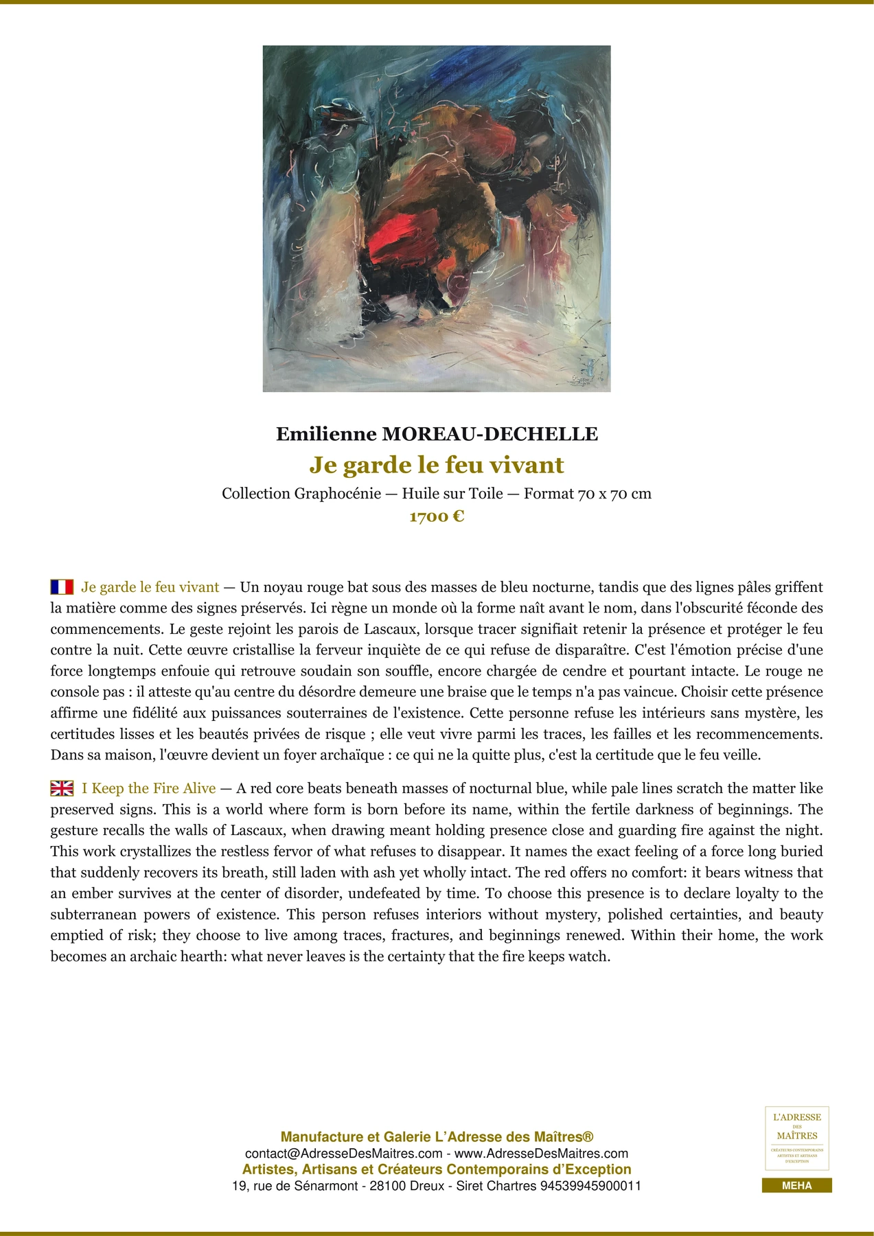
Emilienne MOREAU-DECHELLE presents 41 oil paintings. A title like *Passage sous les braises* immediately draws attention to the evocative power of color. In the context of oil painting, a work like this serves as a reminder of just how well this technique lends itself to deep nuances, warm intensities, and rich transitions.
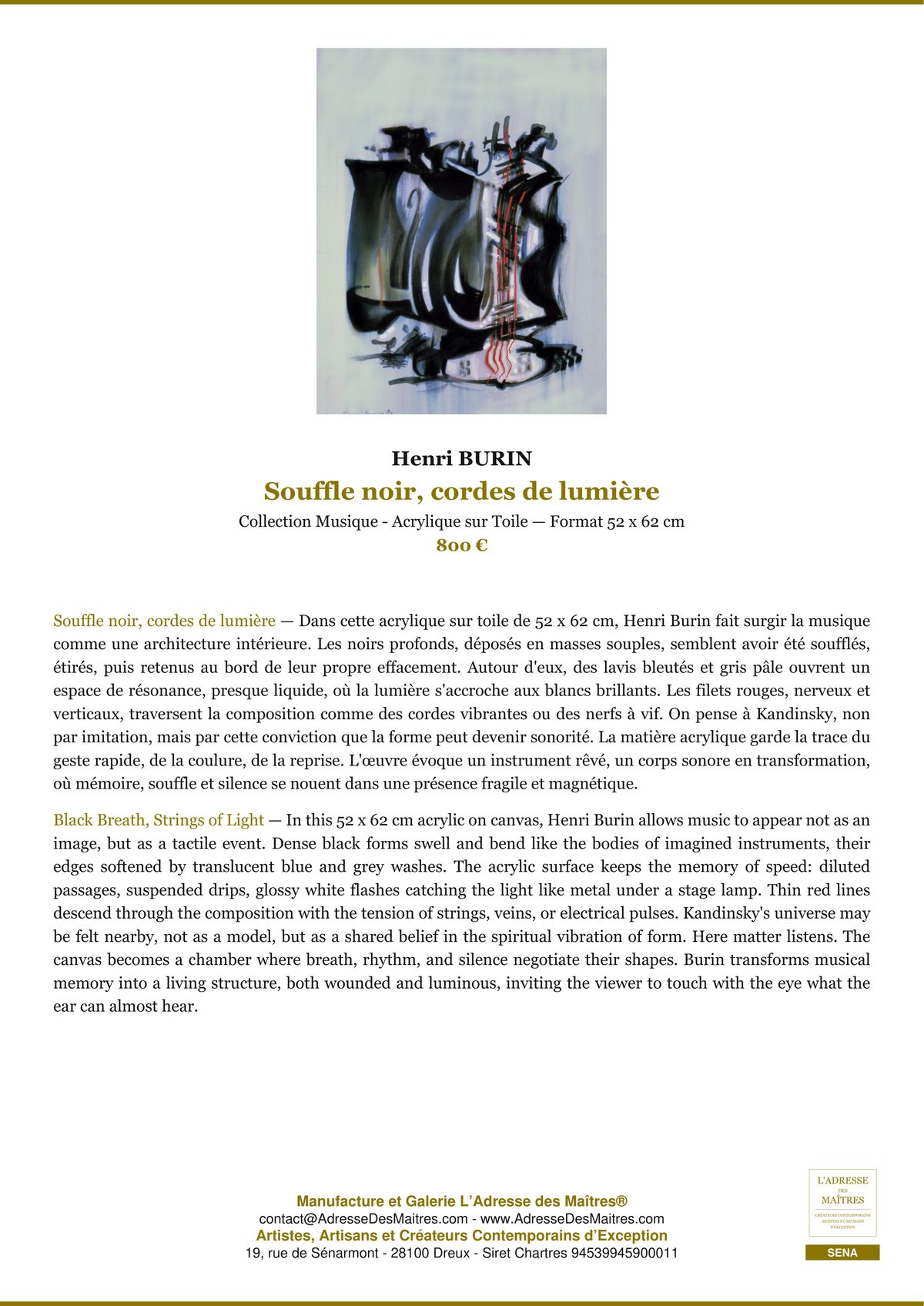
Henri BURIN presents 40 acrylic paintings, including *La contrebasse rêve sous rideau*. Acrylic, with its vibrancy and clarity, offers a particularly interesting medium for exploring contrast, the use of flat areas of color, and the legibility of color. His body of work thus contributes to a reflection on contemporary color and its immediate effects.
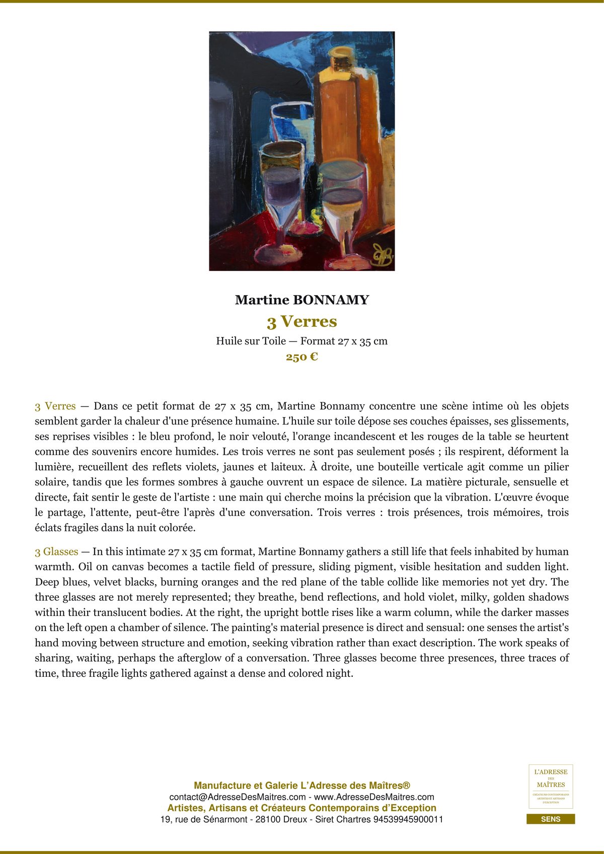
Martine BONNAMY presents 35 oil paintings, including *Céruléenne, mémoire d’un rivage*. The title alone highlights the power of blue in the pictorial imagination. Her work naturally embodies a sensitive approach to color, in which oil painting allows for depth, density, and delicacy.
Bernadette MAURO presents 15 ceramic works, including *Iris, mémoire fendue du feu*. Her work reminds us that color is not limited to painting. In ceramics, color interacts with the material, the firing process, the surface, and light. This enriches our understanding of color in art by giving it a tactile and sculptural dimension.
Sylvia BEAUCHAIN is exhibiting 14 oil paintings, including *La mémoire des courants*. Within the field of oil painting, this work contributes to the exploration of chromatic variations, the play of light, and the evocative atmospheres that color can suggest.
These artists, each working in their own medium, clearly demonstrate that color in art manifests itself in many different ways: intensity, nuance, vibrancy, texture, and depth. For a collector looking to acquire a work of art, this diversity is invaluable.
How Contemporary Artists Use Color
Contemporary artists use color in an extremely free manner. Some carry on the legacy of the great colorists by exploring pure sensation. Others use it to explore perception, identity, space, or memory. Color can be narrative, symbolic, decorative, political, or immersive.
In contemporary art, it can appear as bold blocks of color, translucent layers, geometric fragments, or textured surfaces. It also finds its way into a variety of media: painting, photography, installation, textiles, ceramics, and digital art.
This freedom aligns with the expectations of an audience that is increasingly attuned to the relationship between a work of art and its surroundings. Today, people no longer choose a work of art solely for its subject matter, but also for the chromatic atmosphere it creates. Art-inspired interior design does not reduce the artwork to a mere decorative object; on the contrary, it allows us to reflect on how art inhabits a space.
Choosing a Piece of Art Based on the Colors of Your Home
When choosing a piece of art for your home, you should take into account the colors already present: walls, furniture, textiles, rugs, curtains, decorative objects, and natural light. The goal isn’t necessarily to match everything perfectly, but to create a balanced harmony.
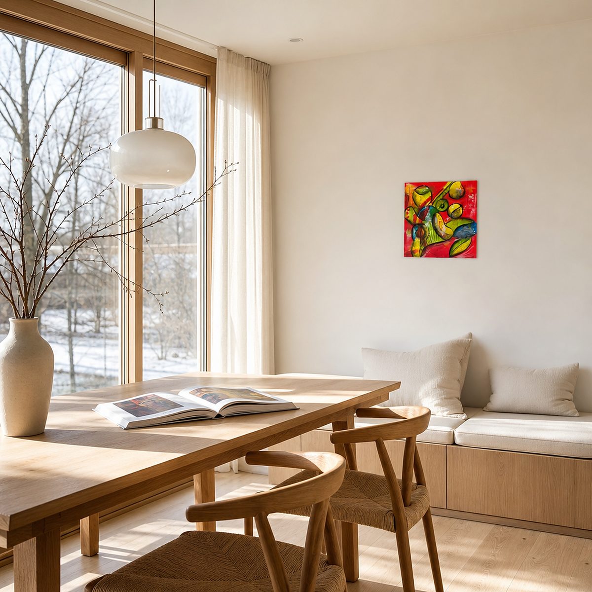
In an interior decorated in neutral tones, a very colorful piece of art can become a strong focal point. A deep red, an intense blue, or a bright yellow can bring a space to life. Conversely, in a room that’s already rich in color, a piece with more subdued tones can provide a sense of breathing room.
You can create color harmony by choosing a piece of art that features a shade already present in the room. This creates an elegant visual continuity. You can also opt for contrast by introducing a complementary color that adds energy to the overall look.
The size of the artwork also matters. A large, colorful piece can define an entire wall, while a smaller piece can serve as a subtle accent. Finally, lighting plays a crucial role: certain colors change significantly depending on whether the light is natural or artificial.
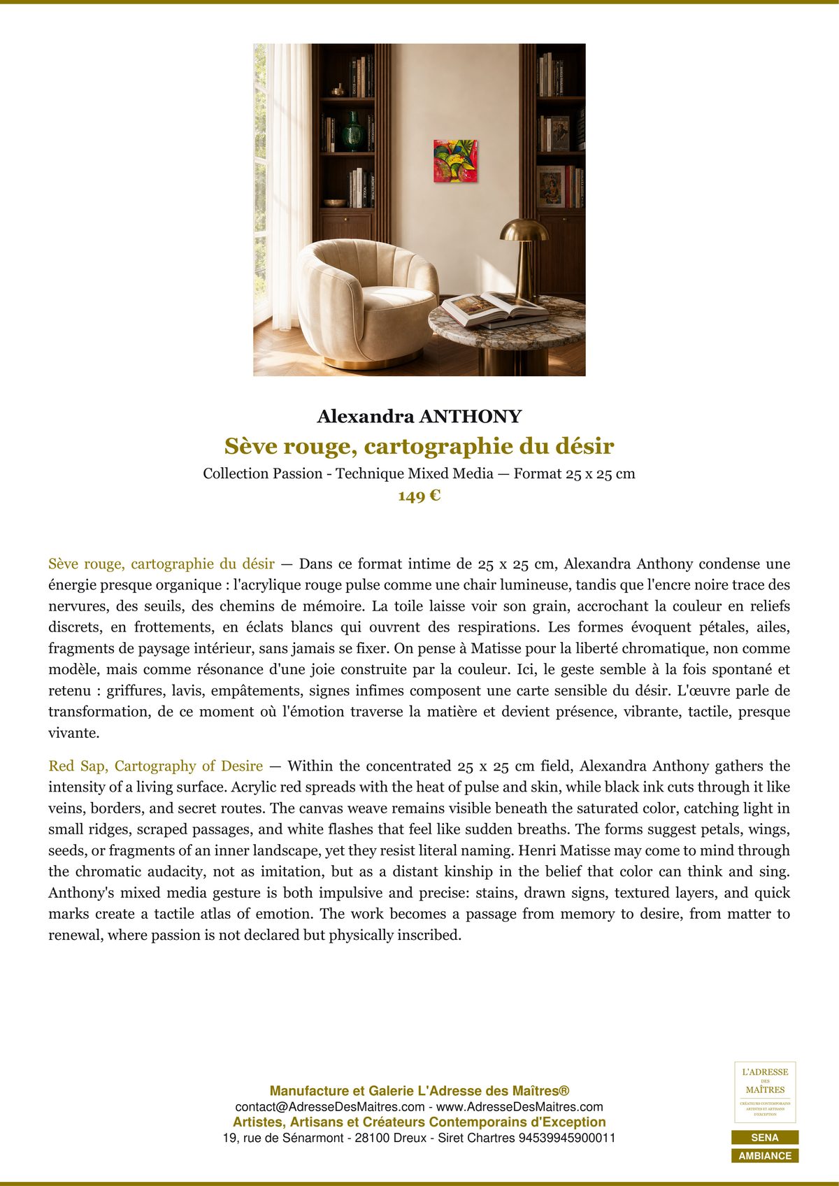
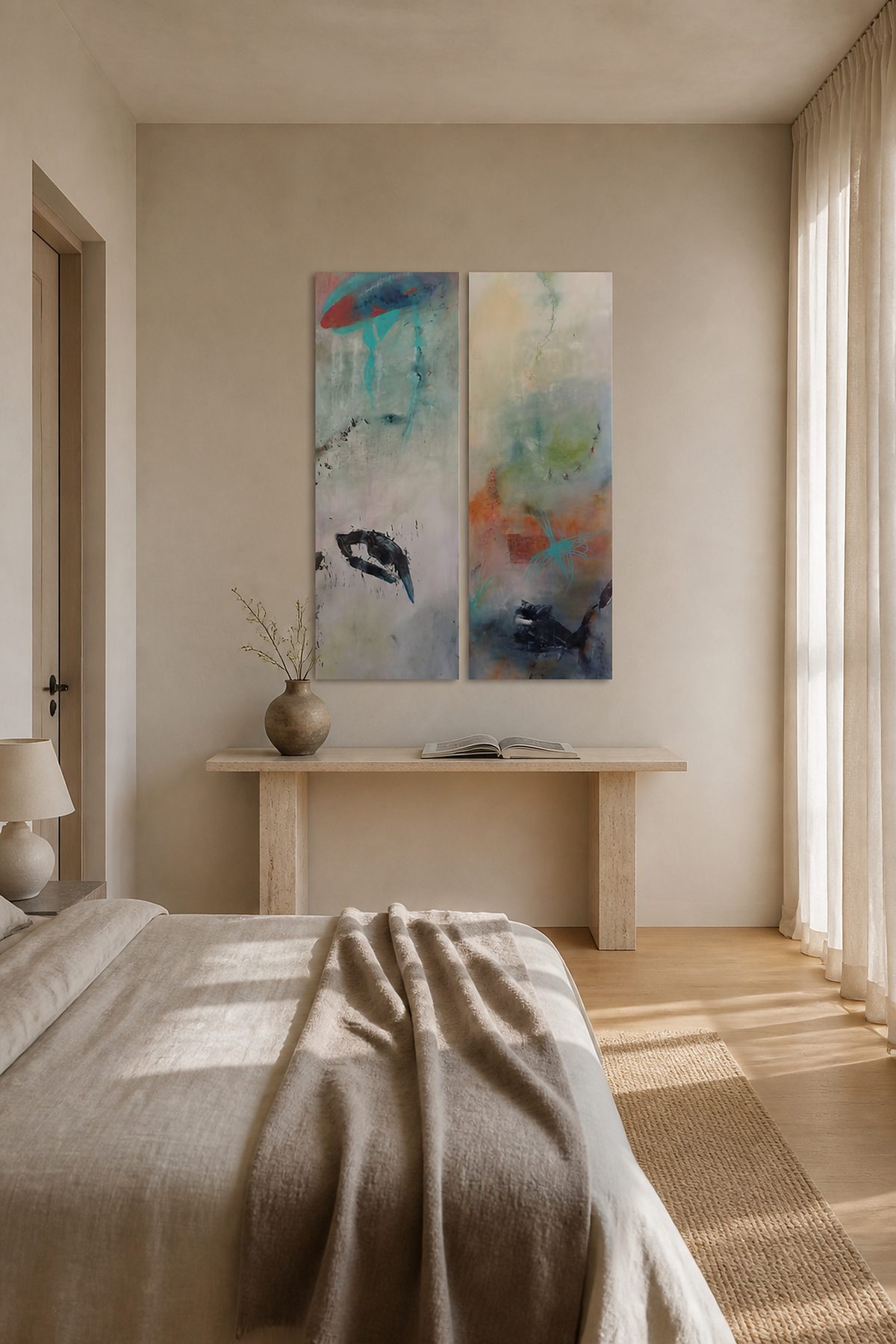
The Premium Ambiance Sheets are particularly useful in making this choice. They help you better visualize how the artwork will fit into a decorative setting and refine your selection based on color palettes, materials, and the desired atmosphere.
The relationship between the frame, the wall, and the artwork
The interplay between the frame, the wall, and the artwork is often crucial. A beautiful artwork that is poorly framed or poorly placed can lose some of its visual impact. Conversely, a good interplay between these three elements fully brings out the artwork’s presence.
The frame should complement the artwork without overshadowing it. A simple frame often highlights very colorful compositions. A more distinctive frame may be appropriate if its tone matches a secondary shade in the artwork. Black adds contrast, white adds lightness, and wood adds warmth.
The color of the wall is just as important. On a white wall, artworks become more visible and vibrant. On a colored wall, they can create a more immersive experience, provided a certain balance is maintained. A very bright artwork can stand out beautifully against a dark background, while a soft color palette will often come into its own against neutral tones.
The key is to think of the whole as a composition. The wall becomes the canvas, the frame the transition, and the artwork the focal point. This approach lies at the heart of a genuine exploration of art-inspired interior design.
Conclusion
Color in art is at once science, language, and emotion. Through the color wheel and primary and complementary colors, it can be analyzed. Through color psychology, it can be felt. Thanks to great colorists such as Matisse, Rothko, Klein, and Delaunay, it can be admired in all its power. And thanks to contemporary artists, it continues to break new ground.
At the L’Adresse des Maîtres® Art Gallery in Dreux, this rich tradition continues through artists such as Emilienne MOREAU-DECHELLE, Henri BURIN, Martine BONNAMY, Bernadette MAURO, and Sylvia BEAUCHAIN, whose works explore color through oil, acrylic, and ceramics.
Whether you’re looking for a vibrant, soothing, or subtle piece of art, understanding color theory helps you make a better choice. And by paying close attention tocolor harmony, the frame, the wall, and the overall atmosphere—especially with the help of the Premium Ambiance Guides —the artwork will naturally find its place in your living space.
Check out our gallery
Would you like to experience these artistic movements in person? Visit the online gallery of L’Adresse des Maîtres®—more than 606 original works by contemporary artists.

Leave a comment